The two versions of a Patagonia Ad
Introduction- Original Ad
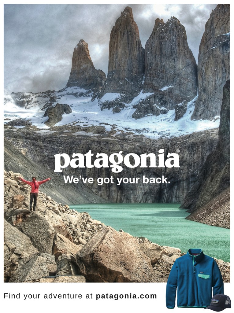
In the ad, I found the nature scene really eye grabbing. I love the tall peaks of the mountains and the blue water on the base of the mountains. It definitely is designed to catch adventurous peoples attention. Because it has the white snow on the mountains, the white words of the logo really pop.
The ad was chosen from the following website: https://www.behance.net/gallery/65530047/Patagonia-Ads
It appears to be made by: Jacob McCarter
Ad Analysis: Design, Color, Typogrophy

Design: The ad uses proximity, alignment and repetition
In the proximity it makes the lady seem small compared to the big mountains in the back implying that even though we are small, we can take on and accomplish great things. It also uses alignment with the logo right in the middle of the ad. The mountains are on the top and the blue water below leads your eyes right to the center where the logo is. The repetition is actually found in nature where the three pillars look very similar. The middle one being the biggest and drawing your eyes into the center of the page where the logo and slogan are found.
The alignment is found in the middle aligning of the logo both in the middle of the page vertical and horizontal so it brings your attention to the center of the page.
Typography is the simplicity of the slogan font but also the fact that it pops out and grabs the attention of the eyes without taking away from the original logo of the brand.
New Ad Analysis: Design, Color and Typography
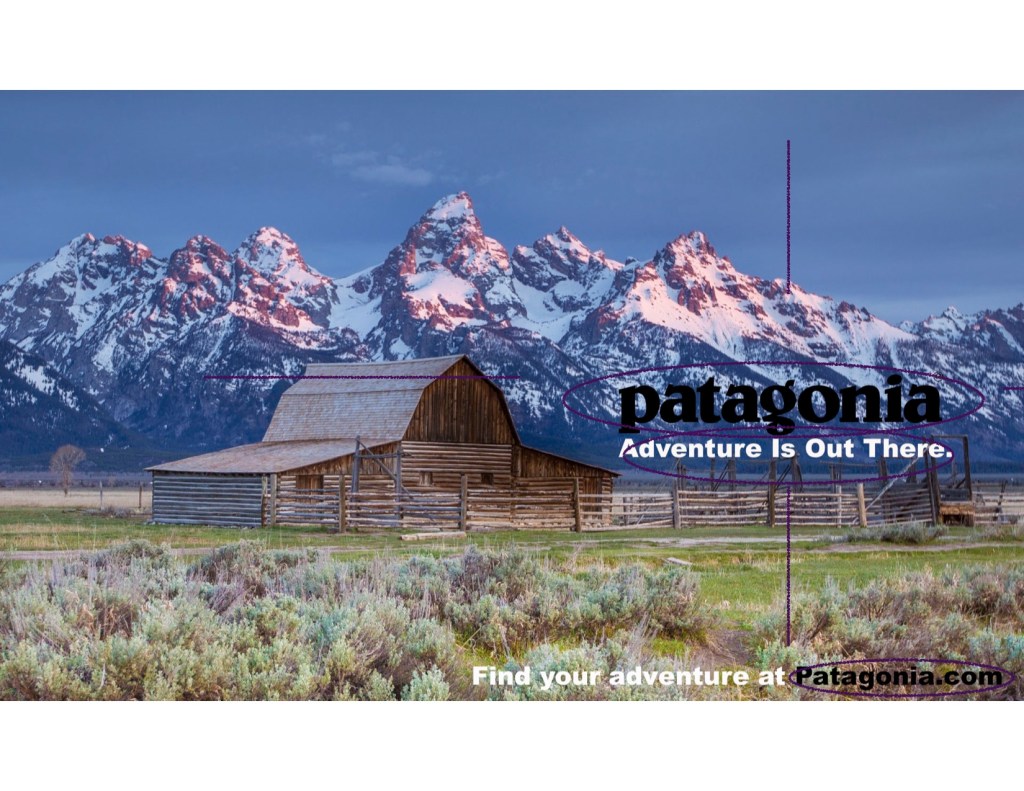
The design that is found here is alignment, repetition and contrast. The alignment is the rule of 2/3 where the eyes are fixed on the right of the page. Instead of placing it right in the middle of the page, it is found off to the right to be a little more pleasing for the eye to look at the logo and the slogan. As well as the call to action at the bottom of the page is off to the right as well. Repetition is found in the mountain range, it is fairly consistent throughout the photo and offers a steady background of blue and white. The contrast is found in the grass and shrubbery at the bottom of the page, the old barn on the right of the page and the blue and white mountains scattered on top of the page. The reason this is pleasing is that although they are all different, they come together nicely in the picture.
The color scheme in these two ads are almost identical. The blue and white mountains, the greenish bottoms are very similar and the words are found in black and white in both of the ads.
The typography in the ad is extremely similar in this ad as in the original. The slogan is a crisp and large font that is easy to read but also is a fun font. The reason for this is that it not only talks about adventure in the words itself but also talks about the adventure in the way it shows the words.
Conclusion:
Patagonia is filled with adventure packed junkies. The reason for both of these ads are to show how beautiful the world is and to give them an itch to put on a Patagonia jacket and get out there and explore. The message is the same in these ads and honestly, it made me want to put on my Patagonia jacket and go on a hike or something so it definitely called me to action.
